Project Overview
Toggle started as speculative design research and grew into a concept for a social gaming café built around play, inclusion, and charitable impact. Inspired by models like Humble Bundle and classic internet café culture, Toggle explored how gaming spaces — physical and digital — could build empathy, shared experiences, and community-driven fundraising.
This was a multi-phase project grounded in rapid prototyping, systems thinking, and brand-driven interaction design. Toggle wasn't a functioning product. It was a question about how tangible environments can support real play through consistent visual identity and clear purpose.
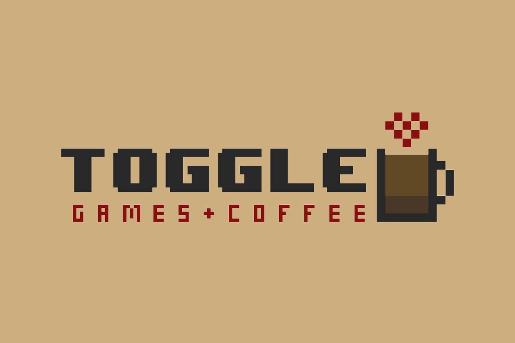
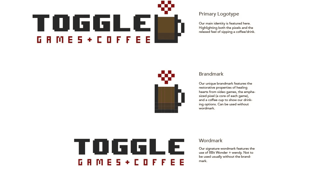
Toggle Logo
Problem Space
Traditional gaming environments can feel overstimulating, exclusive, or overly commercial. This project questioned:
How can design welcome diverse players while building emotional belonging?
How can communal gaming spaces also serve social good?
Design Challenge: Create a concept for a gaming space that:
Blends physical environments with digital motifs.
Centers community and playtesting over profit.
Channels revenue toward charitable causes.
My Role
This was a fast-paced, independent graduate project, refined through:
Collaborative critique sessions, improvisational design reviews, and iterative prototyping.
Ownership of branding and visual identity, from menus to logos, merchandise, and café touchpoints.
System-level thinking to connect the in-store experience with broader philanthropic goals and potential partner engagement for data and playtesting feedback loops.
Tools
Adobe Acrobat
Adobe Illustrator
Adobe InDesign
Adobe Photoshop
Google Suite
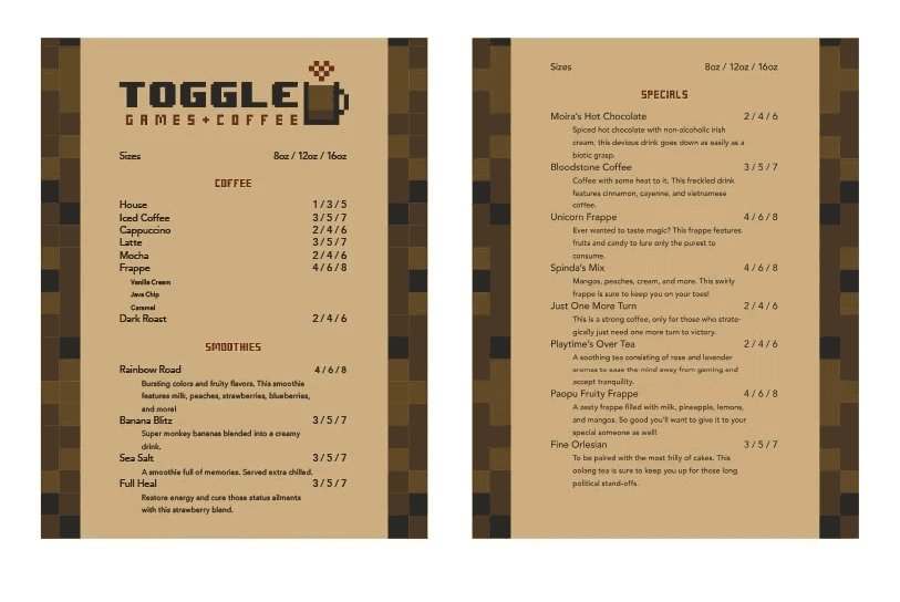
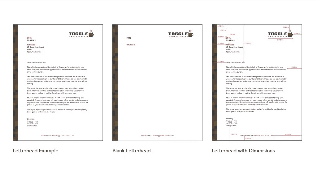
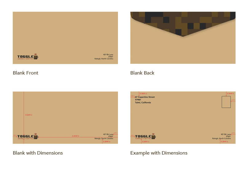
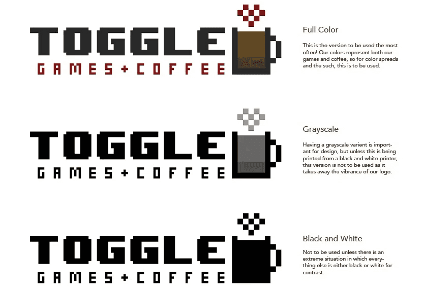
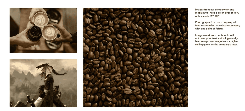
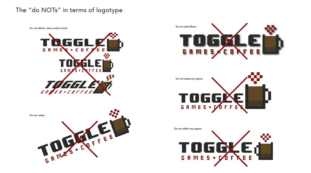
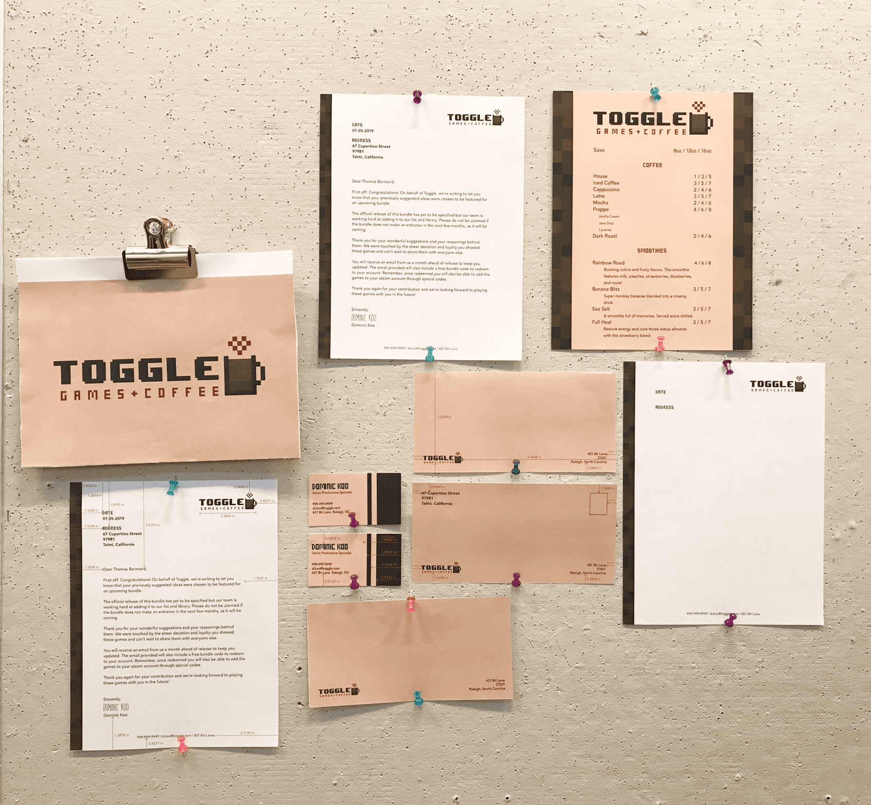
Toggle's visual identity system (menus, correspondence templates, brand guidelines) reflects a cohesive pixel-based aesthetic grounded in warmth and accessibility.
Key UX & Product Design Insights
Rapid Iteration: Generated and evolved 11+ concept versions, adapting to new critiques and merging and disentangling ideas with peers.
Product-System Concepting: Envisioned a hybrid subscription model, in-store rental system, and company partnerships for game demo feedback loops.
Design Communication: Learned to advocate for evolving ideas and design in flux, balancing feedback and creative autonomy.
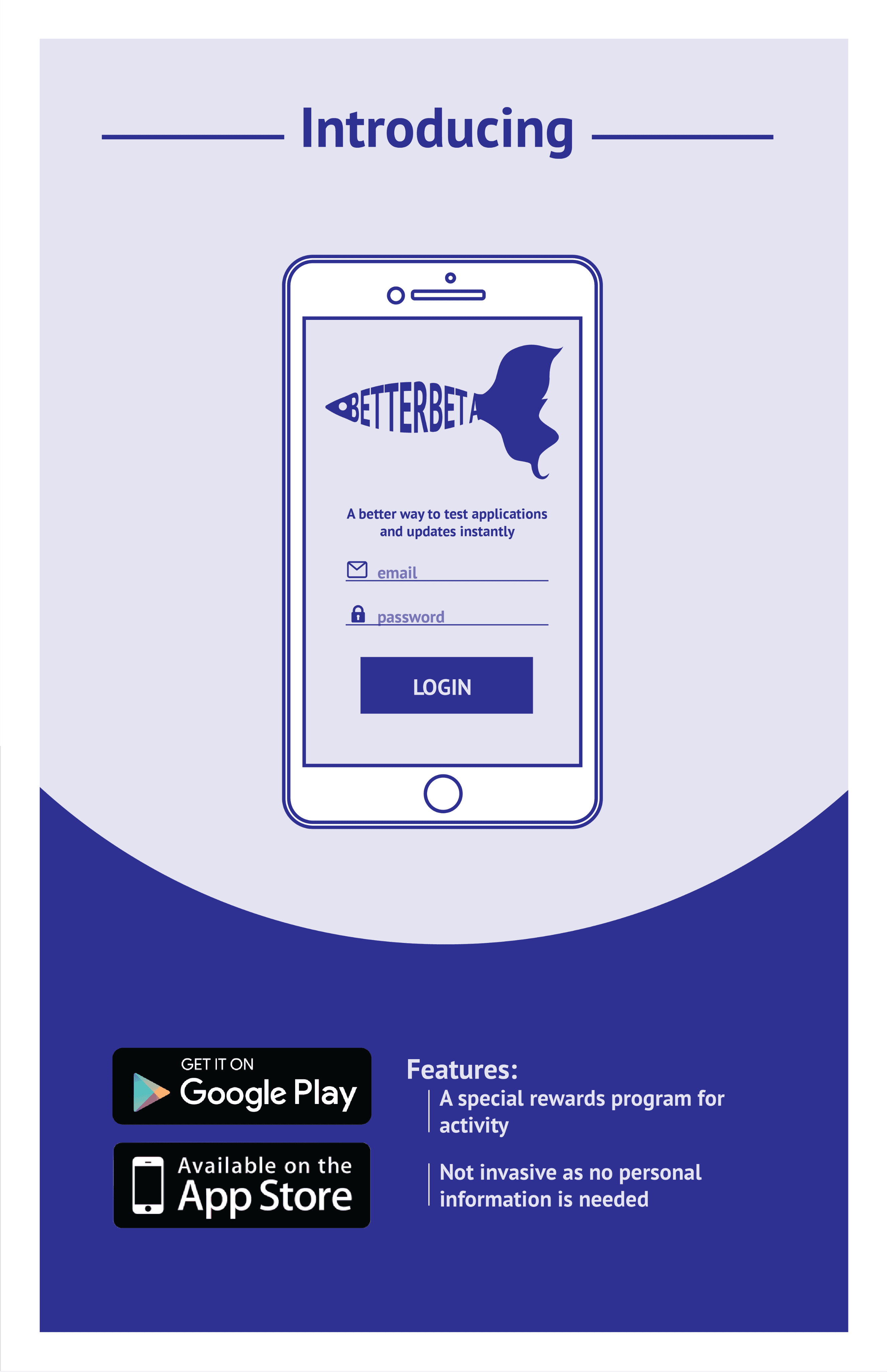
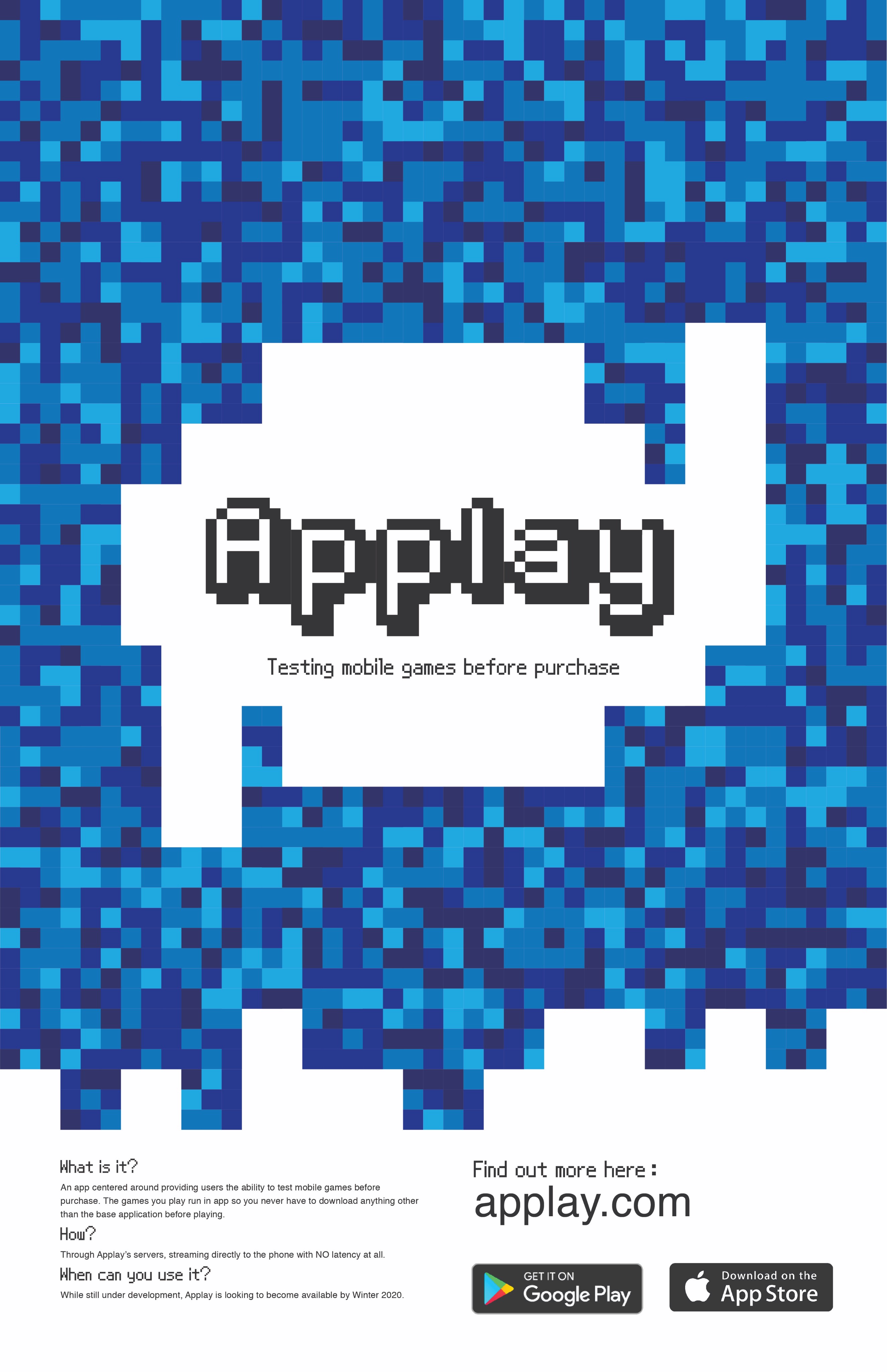
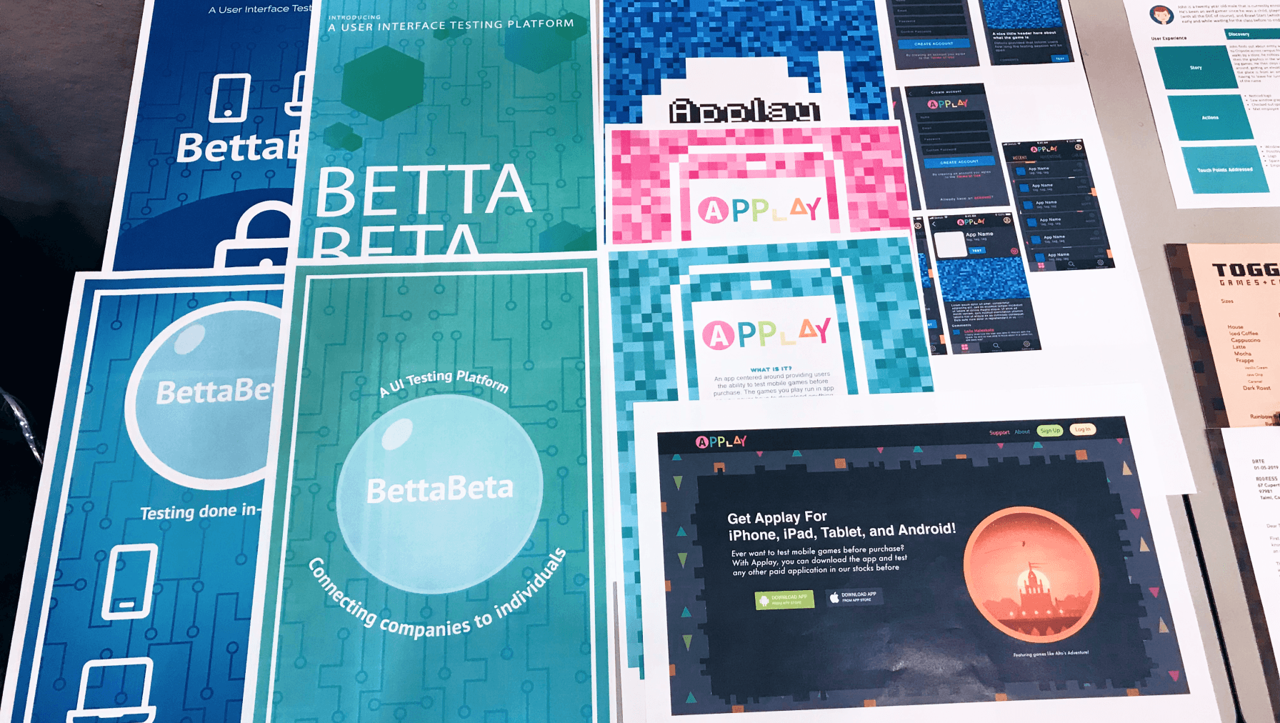
Early concept evolution from app-based beta-testing (BetterBeta, Applay) to a physical gaming café, with each iteration refining user interaction ideas and visual style.
Visual Identity in Service of System Goals
Toggle's visual identity started as creative exploration and became a tool for the experience themes underneath it: comfort, community, and permission to play.
The pixelated logotype did more than look like a style choice. It pulled from retro game culture to create shared nostalgia across a diverse player base.
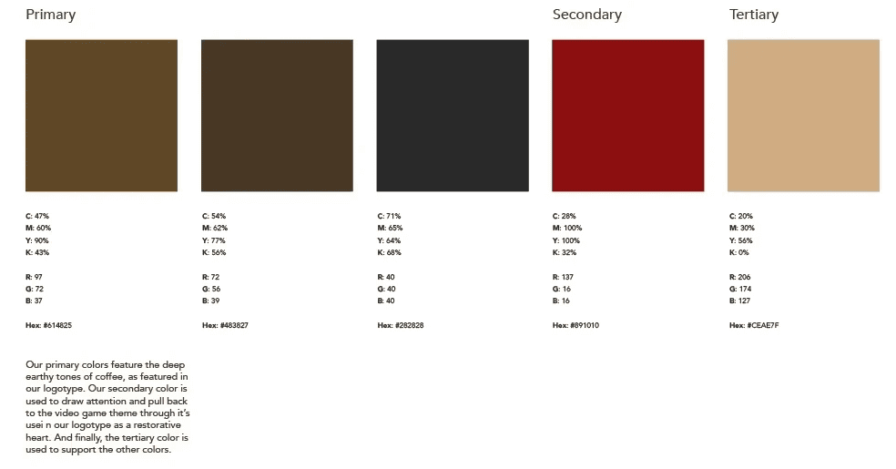
Warm earth tones and energetic reds created a balance between inviting spaces and energized play, designed to feel familiar yet exciting.
Every brand element was treated as a touchpoint: menus, signage, coffee cups, and merchandise all worked to make social play feel cohesive, both online and offline.
This branding exercise taught me how visual consistency supports emotional clarity, and how it helps people feel safe and welcome enough to actually show up. The process deepened my ability to think across physical-digital systems and prototype experiences that feel lived in.
Mid-project critique session where Toggle's design system was evaluated and refined for cohesion and emotional resonance.
While speculative, Toggle helped me:
Think in product ecosystems, not just interfaces.
Embrace experimental workflows, prioritizing iteration over perfection.
Recognize that inclusive systems have to go deeper than aesthetics, and see clearly where accessibility would need to be built in from the start, not retrofitted.
“Toggle was about reminding people they belong.”
If I returned to Toggle today, I'd integrate inclusive design principles more deliberately. The physical space and brand would extend to accommodate diverse physical and cognitive needs, from adaptive playstations to accessible café layouts. I'd explore partnerships with inclusive gaming initiatives so Toggle could serve both fun and equity.