Project Overview

During my collaboration with IBM, I worked with a small team to co-design a chronic illness symptom tracking system using machine learning. Our goal was to build a web-based interface that felt supportive, cognitively lightweight, and empowering for people managing conditions like Crohn's Disease.

The focus was on multi-modal, accessible UX, designed to support personalized control, reduce cognitive strain, and respect the realities of chronic health management.

❓ Problem Space

Chronic illness can bring unpredictable symptoms, fatigue, and decision overload. Many apps overwhelm with data but miss the need for clarity and comfort.

A core question: How can we help users track their symptoms without adding friction, judgment, or cognitive overload?

Close-up of a large grid table filled with orange sticky notes, with hands actively placing and moving notes during a group workshop.
The same grid table, showing many scattered orange sticky notes, showing brainstorming or categorization in progress.
Section of the grid table with several green sticky notes neatly placed, featuring handwritten feedback or ideas, from a design exercise.
Wide view of the grid table filled with green sticky notes spread across different cells, representing organized insights or themes.

Collaborative thinking in action. These workshop moments capture the messy-to-meaningful process of mapping ideas, sorting insights, and finding patterns together. Whether scribbled on orange or green notes, every thought played a role in shaping something smarter and more human-centered.

👥 Team & Role

I contributed as a UX Designer & Researcher, working alongside IBM designers and engineers. My responsibilities focused on:

  • Designing the interface structure and component flows

  • Prototyping low-stimulation, accessible UI patterns

  • Co-developing feedback systems for nonjudgmental engagement

  • Synthesizing testing feedback into thoughtful, low-friction design iterations

Tools

Adobe Acrobat

Adobe After Effects

Adobe Illustrator

Adobe InDesign

Adobe Photoshop

Adobe Premiere Pro

Adobe XD

Figma

Google Workspace

Sketch

Zoom

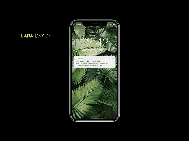
Please make sure your sound is on. This video features Lara. Lara's doctor recommends she download Corey, a companion app for Crohn's patients, to help her prepare for her first colonoscopy. As her colonoscopy approaches, Corey interacts with her.

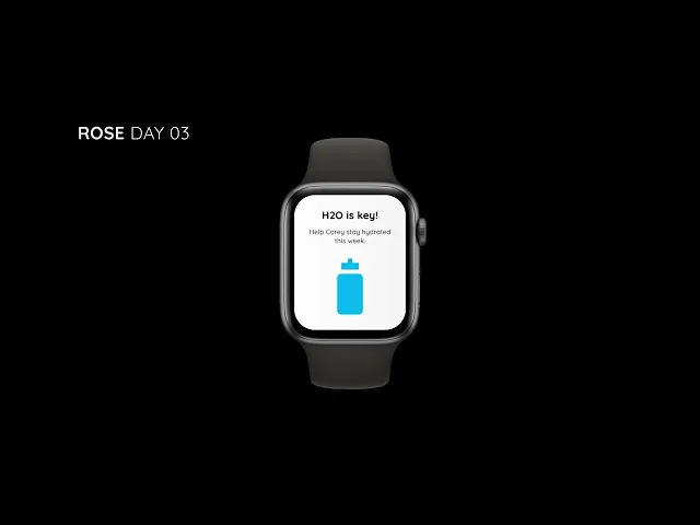
Please make sure your sound is on. This video features Rose. Rose has been managing her Crohn's for years and uses Corey regularly. When it comes time for her annual colonoscopy, Corey is there to provide support.

Profile card for Lara, a 24-year-old woman with shoulder-length blonde hair, wearing a striped shirt, looking slightly off to the side. Text describes her healthcare journey, frustrations, and needs around symptom tracking and treatment.
Profile card for Rose, a 21-year-old woman with long dark hair, standing outdoors in a sunny scene with palm trees, wearing a light blouse. Text covers her health challenges, focus on school, and her need for fast, clear medical communication.
A user journey system map titled 'COREY,' showing how data flows between user devices like a phone, smartwatch, and home assistant. Yellow highlights show where suggestions, actions, and notifications help the user manage tasks.

Lara and Rose represent the real people behind design decisions — each with unique needs, frustrations, and goals. While Lara seeks clarity and control, Rose needs speed and reassurance. The Corey system ties it all together, showing how thoughtful tech can adapt to both, making care feel personal and manageable.

Narrow the Scope

We imagined a future where patients own and control their health data through a single, secure platform, powered by IBM Watson's machine learning.

Pain Points Addressed:

  • Adapting to changing medication routines

  • Difficulty accessing relevant, timely information

  • Tracking complex, variable symptoms over time

A detailed horizontal timeline mapping Lara’s post-diagnosis journey through symptom management. Yellow circles mark key stages. Icons of phones, tablets, and computers represent touchpoints.
A simplified timeline for Rose’s experience with complications and changing medications. Large yellow markers show critical moments. Icons of digital tools at the bottom highlight where interactions occur.
A week-long grid showing Lara’s ideal future journey preparing for a medical procedure, with daily activities and digital touchpoints organized by day.

Behind every journey is a story. Lara's and Rose's paths reveal where care systems can lift burdens or add to them. From post-diagnosis uncertainty to medication changes, these maps spotlight the key moments where support can truly make a difference. The future journey vision reimagines this process — structured, calm, and in sync with their lives.

Explore Ideas

Through user testing and peer feedback, we shifted our design approach:

  • Simplified from a koala-themed companion (originally “Crohny”) to a more neutral, inviting interface.

  • Focused on web-based UI adaptable to both smartwatches and mobile phones.

  • Prioritized low-cognitive-load design: easy-to-use, visually minimal, and accessible through clear, responsive buttons.

A clean dashboard with Lara’s documents organized in stacks: lab reports, prescriptions, health forms, etc. Notifications show new updates uploaded by Sharon.
A detailed report page displaying Lara’s C-Reactive Protein Test results, including a summary and guidance from her doctor about what the results mean.
Visual summary of lab results with recommendations. A graph at the bottom tracks neutrophil levels over 6 months with color-coded markers.

A dashboard designed for peace of mind. Lara can easily find her lab results, prescriptions, and health forms — no hunting, no guessing. Each report is clear, with guidance that's easy to act on, and visual trends help her stay informed without being overwhelmed.

A dashboard designed for peace of mind. Lara can easily find her lab results, prescriptions, and health forms — no hunting, no guessing. Each report is clear, with guidance that's easy to act on, and visual trends help her stay informed without being overwhelmed.

A set of 3 phone mockups guiding the user to stop taking iron supplements, set reminders, and confirming progress with a green checkmark.
Another set of 3 phone screens offering dietary advice, suggestions with simple icons, and encouragement to stay hydrated, ending with a green checkmark for food prep.

Care doesn't stop at the clinic. These screens guide Lara through daily prep, with gentle reminders and friendly encouragement. From managing supplements to choosing the right foods, the app helps her stay ready, one simple step at a time.

Care doesn't stop at the clinic. These screens guide Lara through daily prep, with gentle reminders and friendly encouragement. From managing supplements to choosing the right foods, the app helps her stay ready, one simple step at a time.

A cheerful screen with a cute cartoon koala smiling on a green patch of grass. Text celebrates Corey feeling better after a helpful meal.
A grocery list screen with items checked off, like white bread and crackers, encouraging the user to stock up for Corey’s needs.

Corey's journey includes the good days too. A cheerful check-in and an easy grocery list set the tone for supportive, everyday care. It's about making health feel a little lighter, one koala-approved moment at a time.

Outcome & Reflection

Outcome & Reflection

This project sharpened how I approach emotionally sensitive UX and health-related design:

  • Accessibility isn't just a feature — it's the foundation.

  • Visual hierarchy and microcopy shape how users feel, not just what they do.

  • Clarity and simplicity are vital when people are managing health, stress, or fatigue.

Core Competencies

Accessibility-First UX Design

Animation & Motion Design

Audio Editing & Sound Design

Communication & Cross-Functional Collaboration

Concept Mapping & Framework Design

Data Visualization for Health Tech

Design Thinking & Iterative Testing

Empathy-Driven Research

Evaluative & Qualitative Research

Inclusive Interface Design

Instructional & Visual Design Systems

Low-Fidelity & High-Fidelity Prototyping

Machine Learning UX

Mental Model Mapping

Microcopy & UX Writing

Scenario Mapping & Journey Mapping

Storytelling Through Systems

Surveys & User Interviews

Time Management in Agile Environments

User-Centered Design & Accessibility Standards

Visual Systems Thinking

Information Architecture

Storytelling

Empathy

Time Management

User-Centered Design